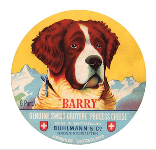
Having posted lots of examples of the grimness of beer beer taps, I received a link to this page the other day and thought some examples of appealing labels might be a good idea.
I appreciate they are not beer brands but the simplicity and pared down style of these cheese labels is to my mind attractive. I like the simple palates of colours, reminiscent of 1940's railway posters and the fact no one thought sticking a pair of suspenders on a cow would sell more cheese spread.
Oh and seeing as many beer labels are so poor maybe getting inspiration from elsewhere might be a good idea.

Whatever happened to the Cheese Trumps brand?
ReplyDeleteBut seriously – some beautiful typography in that cheesy slideshow.
Barry does looks a little embarassed to me......
ReplyDeleteWonder if can I use that to help German speakers pronounce my name, and stop calling me Berry. "Ah, you are ze Blackberry, no? Hahh hahh hahh"
ReplyDelete